V9 - News
In color charts, colors are assigned in two ways: by value in the specific case of pie charts, and alphabetically in all other charts that allow color. When a pie chart and another type of chart representing the same dimension are displayed together, the color assigned to the same value may be different in one chart and another, which is not ideal for a good user experience. To control these cases, an option is added to the chart customization that allows you to always assign the color of the charts by the numerical value of the dimension.V9.10.0
Edition
Color assignment by value in charts
Example of color assignment alphabetically and by value
Alphabetical order for legends in pie charts
In a pie chart, colors are naturally assigned according to the value represented, and the chart legend is also arranged according to this value criterion. In other types of charts, which are less specific in nature than pie charts, the legend is arranged in alphabetical order. When a pie chart and another type of chart representing the same dimension are arranged together, the legend is arranged in a different order, which is not convenient for a good user experience. To control these cases, a specific option is added to the chart customization that allows the pie chart legend to be sorted alphabetically.
Legend in alphabetical order in pie charts
V9.9.0
View
Multiuser markers
A special scope is added so that the markers in view of those users are global for all users of the same tenant. Consult with the Vision administrator to include this scope in the call to a dashboard.
When adding a marker, these users have the option of making the marker global.
How to add markers for individual users or for all users
Edition
Detailed navigation in charts
Charts allow you to include special links in their representation, so that when you click on a part of the chart, the value associated with the X-axis is taken and one of the three options below is performed:
- Drill-through filter link: filters the rest of the widgets in the tab by the value related to the click. The link is added in the general section of the chart customization.
- Link to detail or internal navigation: link to another tab, applying the value relative to the click as a temporary filter. The link is added in the customization of numeric fields.
- Cross-navigation link: links to a URL external to the dashboard, allowing the click value and the values filtered in the tab to be used as parameters when constructing the destination URL. The link is added in the customization of numeric fields.
If more than one option is to be added, and given that a direct click can only correspond to one of them, a “right-click” menu is enabled where the enabled options are displayed.
How to enable special links in charts
V9.8.0
Edition
Languages with culture option
Multilingual dashboards and datasets allow you to add different languages (two-letter codes) for labeling and consumption. From this version onwards, you can add either the two-letter code (es, pt, en, etc.) or a five-letter string, where the language is accompanied by the culture, for example es-ar, pt-br, en-us, etc. The first part of the string controls the language displayed in a dashboard in the general options (configuration options, menu texts, etc.), while the culture provides the new set of labels related to the content.
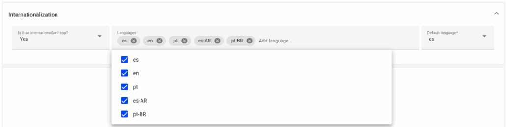
Multiple languages + cultures in a dashboard
For example, a dashboard with the internationalization options es, es-es and es-ar displays the common elements in Spanish, which are the same for all three options, and then specifies the titles, descriptions, field names, and other elements specific to the dashboard according to the culture.
Although it is advisable to follow the ISO standard for languages, the only restriction on the two associated characters is that they must be letters. In the case of the culture, the recommendation is to use an ISO country or region code, but again, any two letters can be used. If the culture is added, both strings must be separated by a hyphen (-).
V9.6.0
Edition
Widget order for mobile view
In a dashboard tab, the layout of widgets is explicitly set by the editor. However, this design applies when there is sufficient screen space; otherwise, a series of responsive rules are applied that adapt the content to a mobile device or tablet, where the screen width is reduced.
In these cases, it is possible to assign a specific order to ensure a positive user experience.
Example of widget order in mobile view
V9.5.0
Edition
Georeference menu (dataset)
Fields of a geographic nature can be georeferenced to be included in map widgets. Georeference has a new menu, with the following particularities:
- List with the georeferences of a dataset: the list allows you to see all the georeferences associated to a dataset, add new ones, edit the existing ones and delete the unwanted ones.
- Editing address and/or ISO code type georeferences: the values of a field representing a geographic entity such as a country, region, etc., are associated with georeferenced polygons or surfaces that allow their location on a map. The process works as follows:
- A field is georeferenced as an address or ISO code. There is a process that automatically synchronizes values with polygons available in Vision's georeference database.
- Those values that are uniquely associated are taken as good. Example: “Spain” has no ambiguity, the association is direct.
- Those values that are not uniquely associated are attempted to be associated, in a second pass, based on information related to the majority of those already associated:
- Example: “Madrid” can be an autonomous community (territorial division of level 1) or a province (territorial division of level 2) of Spain, if the majority of associated values is of the province type, this will be the associated type.
- Example: “Cordoba” can be a province of Spain or a province of Argentina, if most of the associated values are related to the country Spain, the association is with the province of Spain.
- Those values that do not have a clear reference are left unassigned. In such cases, the dataset editor can access the georeference list and manually search for the valid georeference:
- In the drop-down menu you can select one of the available options, if any, and mark the record as verified.
- In the alternative value box you can type a text that allows a direct association. For example, if the text that appears in the dataset is “*pain”, it is not associated to any valid georeference, however, by typing the alternative text “Spain” the drop-down will allow to obtain the desired georeference. Once selected, the record is marked as verified, and the association is registered.
- There are values that are not currently in the dataset, but it is known that they may appear (which is the usual case when developing a dashboard with test data). In these cases it is allowed to enter georeferenced values manually, either by manually adding a line or by adding multiple lines in bulk from a csv file (the file can have a single column with the dataset value, or two columns separated by “;” with the dataset value and the alternative text). These added georeferences have to be verified manually by the dataset editor.
- Save changes: all changes made in the menu are only saved by clicking the “OK” button, otherwise they are lost.
Operation of the georeferencing menu
Field reindexing (dataset)
Vision datasets include 64 indexes, which can be distributed among the fields of the dataset. By default, and transparently to the user, the first 64 fields are indexed.
This practice, reasonable in usual cases, may be inappropriate in certain advanced cases:
- When a dataset has more than 64 fields, and some index-worthy fields are in a position above 64.
- When a dataset has many records (+1M) and is taking up space in the DB unnecessarily, and can also compromise performance when accessing the data.
A functionality has been included that allows you to:
- Verify which fields are indexed in a dataset;
- In the case of datasets that have a DB connection as data source, reindex the fields at will. The reindexing, a priori, must be done according to the needs of use, i.e., an index must be applied to fields that are used in filters, in combination blocks, etc. This complex process is also provided to the user: the reindexing menu automatically runs a scoring process that suggests which fields should be indexed and which can be ignored (it goes through and evaluates in the different dashboards that use each field of the dataset), if the user agrees, they can directly accept the suggestion (recommended), but they also have the option to choose which fields they want to index or not. If the user accepts the reindexing, it is not done immediately, but in the next scheduled data load.
Field reindexing
V9.3.0
Administration
- Multi-product support for tenants
V9.2.0
View
Gauge chart
The gauge chart is a new type of chart that allows different measurements to be displayed on the same scale, which facilitates visual comparison.
The representation of the values is in radial form, and always related to a range of minimum and maximum values: by default, the minimum value is 0 and the maximum value is that of the measurement with the highest value. However, in the chart configuration itself it is possible to change the scale relative to the measurements, i.e., one of them can be chosen as the minimum and/or maximum value, adapting the chart to that scale. Any value outside the range is “out” of the graph, either by default or by excess.
In addition, it is also possible to represent the measurements as a percentage (relative to the sum of all measurements). In this case the scale is automatically set to 0 to 100.
Example of a gauge chart
Edition
Gauge chart
The gauge chart is constructed from measurements only. The order in which the fields are customized determines how the values appear on the chart, with the first measurement being the outermost and the last measurement being the innermost.
In addition, the chart scale is set automatically by default. In the configuration menu there is an option that allows to vary the scale from the represented measurements, but in some cases one may want to set the minimum and maximum values to default values. This is possible by editing the chart annotations, one of the chart customization options. In the annotations, the “min” or “max” annotation type is selected for the minimum and maximum of the scale, and either a fixed value determined by the user or a dynamic value obtained from a subquery is chosen.
Customization of the gauge chart
Filter groups
Filter widgets can include as many fields as desired, and in the order that the editor provides. Generally, there are dimensions that are always close to each other, since they make sense as a “group”. Sometimes, to differentiate such groups, several filter widgets are created, so that there is control over each of them to differentiate them from other groups. However, adding several widgets may hinder the performance of dataset queries, so we have added a functionality to simulate groups of fields in the same widget.
Once the widget has all the desired fields included, in the customization of the components the desired group headers can be added: all the fields below a header belong to the same group until the next header is reached. Each group has a title and an associated CSS class: if you want, you can customize each group to make it different from the rest, just as you can do with different widgets.
Therefore, you can actually always use a single filter widget, which can be divided into groups as appropriate. The only exception occurs in the case of having defined hierarchies: a hierarchy establishes an order of dependency between several fields, so that if the first field of the hierarchy is filtered, the rest of the fields respond to the filtering, and so on with the successive fields. If you want several hierarchies to work independently of each other, it is necessary to create different filter widgets, each with its own hierarchy.
Example of field groups in filters
Transpose block in queries
Datasets in Vision have a fixed structure, with columns containing dimensions and measures, and rows containing the data record. An editor user then uses this data structure in each widget to create a query that displays the data as desired. Although it is possible to perform complex queries and “flip” the data, it is normal that this structure of rows and columns is maintained, and therefore, there are certain limits to the exploitation of a dataset.
To largely overcome these limitations, we have added the “Transpose” block: this block allows you to transpose the structure or to pivot from rows to columns or from columns to rows. The operation of each option is as follows:
- Rows to columns
- A single dimension (text or date column) is chosen by which to transpose or pivot. The resulting data set maintains the structure of the other dimensions;
- One selects which values of the dimension one wants to transpose ( not necessarily all of them). These values must be explicitly indicated in the transposed values text box and, logically, they are the names of the new columns;
- The measurement (numeric column) to be transposed is selected.

Simple example of transposing rows to columns
- Columns to rows
- All measures that reach the block are included in the transposition;
- A name for the new dimension is chosen;
- All dimensions prior to transposition are left intact. Each original row is split into as many rows as the number of dimensions selected for transposition.
- The dimension values are the names or labels of the measurements (internationalization is preserved in case the measurements are multilingual);
- A name for the new measure is chosen.

Simple example of transposing columns to rows
Note: this block can only be used as the last block in a query.
Example of transposition in queries
Style by reference in tables
Dashboards in Vision can include styling in components based on CSS classes. However, this styling is static and sometimes limits the characterization of certain details associated with specific values or fields. To overcome this limitation, the option of styling by reference has been introduced in simple and pivot tables. This option allows to link or reference a style to field values instead of positions in rows or columns. Therefore, such values can be moved in the table layout (due to the action of filters or changes in the configuration) while retaining the assigned style.
The style by reference is added by placing the cursor on a part of the table and right-clicking. This enables a selection menu based on the part of the table (or type) to which you want to add the style. In practice, this way of customizing the style is a set of conditional rules that are applied independently to headers, rows, columns, or cells. For example, when a field has a style associated with the row type and is changed to a column, the style no longer applies, so the editor must set the complete set of conditions to be applied.
The style editor also has a "Selection" section to facilitate the generalization of rules: it explicitly indicates to which set of dimension and measurement values the rule applies, which can be generalized to all values or changed at will.
Example of styles by reference in tables
V9.1.0
View
Ranking and row number in simple table configuration
In the simple tables you can add a row number column, and also a ranking column based on the value of a measure. In the previous version this option was in the customization of a widget, in the dashboard edition. Currently the feature is moved to the configuration menu of a table, and therefore is now a simple table option accessible to the end user.
Ranking and row number in configuration menu
Edition
Dynamic change of the measure scale
Sometimes, when you have measurements of a monetary nature whose range of values is very wide, the user may find that the value displayed on the screen is quite “long”, and sometimes it may even be uninteresting to display the exact figure. Each measurement can be scaled according to its value, either in the measurement customization in the dataset or directly in the widget. However, the scaling is individual for each measurement, and automatically performed, without any user intervention.
This version incorporates a new functionality that allows scaling one or several measurements all at the same time and dynamically selecting the desired scale by the end user. To this end, a “currency” menu can be added to a dashboard to manage the scale. This menu alone does not make any change: for it to take effect, it is necessary to indicate which measurements are marked with the “currency” type, which is done either in the measurement customization in the dataset or in each widget of a dashboard. Note that the customization of each measurement will be respected with the scaling: the precision, unit, etc., are those of the original measurement.
How to enable and use the currency menu in a dashboard
Hide parts of a chart
Charts, by default, have a wide variety of options, both in terms of configuration and customization. However, sometimes you may want to lighten the chart to give it a different style. To do so, in customization, you can hide/show elements such as the title, the axis lines, the chart's internal grid and the lines that mark the values on the axes, for each axis.
If the entire configuration is also removed, the chart becomes a static image.
Example of how to hide parts of a chart
Options for folding pivot table configurations
Pivot tables have a very complete configuration menu: it allows to set dimensions in columns, rows, or to have them disabled, and it also allows to add and remove measures from the data area. When the number of fields added to the pivot table is large, the configuration menu becomes “small”. To make the use of the configuration more practical, the sections can be folded, leaving more space for the rest of the blocks. This can be done directly in view, but to make the change permanent you can go into the pivot table customization and enable the folded block option by default.
Furthermore, the configuration has a second options tab, thanks to which it is possible to add variations, percentages and totals. Sometimes such calculations do not make sense, so the menu can be confusing if it is visible, therefore, a new option is added in the customization to remove such a tab and only leave the field layout menu visible.
Option to fold blocks in the pivot table configuration
Order in bar charts
Bar charts, by default, place the bars on the X-axis of the chart according to the order of the dimension values. The customization includes an option that allows to order the values on the X-axis according to the value of the measure, resulting in a descending chart in value.
Example of how to change the order in bar charts
V9.0.0
View
Parallel coordinates graph
A new type of graph is added: parallel coordinates. This graph works with one dimension, as a series, and several measures that form a structure of several parallel axes, each with its scale and unit, which compose one graph for each series.
Example of a parallel coordinate graph
Selected value chips
All value selections in filters are reflected in a ""chip"" at the top section of each tab. This makes it easier to view without the need to have the filters visible, particularly when the filters are collapsed. Each chip has a ""close"" button, which removes the selection made, without the need to specifically click on the filters.
Each filtered dimension or measure has its own chip, which displays the selected values. If there are a lot of values, the first ones are displayed, and if the user wants to see them all, they can click on the actual chip to expand it.
Examples of different chips according to the filtered field
Edition
Refreshing of datasets
The schedule for refreshing or updating datasets allows setting as many refresh types as the user wishes, unlike the previous version, where it was only possible to set one refresh type. To facilitate the implementation, several default schedules are provided. Any of them can be added, taken as a template, and then modified to suit the needs. It is also possible to start from an empty schedule and to clone and delete schedules.
The new configuration panel is very similar to meeting schedulers or event launchers, with several options for setting refresh options:
- Refresh frequency according to the most common time ranges (minutes, hours, days, weeks, etc.).
- Time at which the refresh is scheduled. This time entered is the local time of the user doing the planning, it must be taken into account in situations where there are users in different time zones.
- DDays of the week. This particular option is very commonly used, it allows to indicate if the refreshment is required only on specific days of the week.
- Months of the year. Equivalent to the previous one, it allows you to enable specific months of the year.
- Position in the set. This comma-separated list of integers allows you to restrict the enabled schedules to a particular subset based on the time order. For example, if a monthly frequency is selected where only Mondays are enabled, the set of schedules are all Mondays of the month. In that case, the value “1” enables the first Monday of each month, the value “2,3” enables the second and third Monday of each month, and the value “-1” enables the last Monday of each month.
- Days of the year. Allows you to specify specific days of the year, from a list of positive integers separated by commas. For example, the value “1,32” enables the refresh on January 1st and February 1st, which has the position 32 in the list of the 365/366 days of the year.
- Days of the month. Equivalent to the previous one, this option allows to indicate specific days of each month. For example, the value “1,15” enables the refresh on the 1st and 15th day of each month.
- Full load option. This option allows you to indicate that the update is complete, that is, it deletes all the data in the dataset and loads them again. It is indicated for cases in which the type of update is incremental, but a complete update is to be introduced with a certain frequency.
Note: Please note that not all options are compatible with each other, that is, they cannot all be configured at the same time.
Apart from the configurator, at the bottom of each dashboard there is a window with a short list of upcoming schedules, which allows the user to check if the configuration is really the desired one. In order to be universal for all users the displayed time is always relative to the GMT+00:00 zone.
Examples of different refreshment schedules
Filter layout
Filters are widgets that are specific to each tab. In this version, 3 options are enabled for display of the filters on the canvas:
- Collapsible horizontal panel This is the default option that appears when you create a dashboard or a new tab: the filters are placed in a specific panel at the top section of the tab. This panel always appears collapsed, and is displayed when you click on the ""Edit Filters"" button, which means that the content of the tab is moved down to make room for filters. Once the selection has been made, the panel can be left expanded or collapsed. In addition, you can add and rearrange as many filter widgets as you like in the panel.
- Collapsible vertical panel Filters are placed in a dedicated panel on the left section of the tab. This panel is always collapsed, and is displayed by clicking on the ""Edit Filters"" button. By enabling the vertical display of filters, this makes the section overlap with the tab content, but the section can also be set as always visible, which shifts the tab content to the right and resizes it according to the new available width. Once the selection has been made, the panel can be left expanded or collapsed. In addition, you can add and rearrange as many filter widgets as you like in the panel.
- Filters visible as a widget This option allows you to add a filter widget with your content, place it anywhere on the canvas as another widget, and customise it according to your preference.
Different options for displaying filters in each tab
Types of selection in filters
In the combo filter, you can change the type of selection that is permitted: to access the options, click on the icon at the top right section of the combo:
- Multiple selection: this is the default selection, which allows you to enable/disable the desired values in the list by clicking on them.
- Simple selection: this allows you to select only one value from the list of possible values, when you click on a value, it is selected and this deselects the previous one. Through customisation, the ‘select all’ option can also be enabled, although the next click will again include only one value.
- Select to/from: based on the order of the list of filter values, this option allows you to select from the first value in the list to the value you have clicked on, or from the value to the end of the list, depending on the option selected.
Furthermore, in any of the options, it is possible to use the search text box to narrow down the list of values to those that match the typed string, which makes it easier to navigate long lists.
Different types of filter selections
Filter hierarchies in dashboard editing
In previous versions, hierarchies between dimensions were defined in each dataset. Subsequently, in a dashboard, a hierarchy was included in the query if so desired.
This behaviour changes in V9: hierarchies disappear from the datasets, and are therefore no longer included in the query of a filter widget. To have hierarchical behaviour, simply access the customisation of a combo filter widget, and in the Hierarchy section, indicate which dimensions are going to be hierarchical and which are not. The order of the hierarchy indicates how the content of each field in the widget is cascaded, but the fields are sorted according to the list in the customised Components tab.
How to add a hierarchy in a combo
Calendar in general filter
The specific ""calendar filter"" widget is no longer available, and calendars are managed in the general ""filter"" widget. The calendar feature remains the same as in previous versions:
- The date format changes the depth of the calendar.
- Menu with the most common predefined options, together with the ""reset"" option to undo any filtering by calendar date.
- Option to disable predefined options
- Option to limit the range between ""from"" and ""to"" dates to a maximum number of days.
As calendars are now part of the overall filter, they are integrated as an additional dimension of the filter:
- They do not require the inclusion of a specific query as a filter.
- Calendar dates are sorted in the same way as any other component.
- They can form part of hierarchies between dimensions.
Date filter as a calendar in a general filter
Note: V8 dashboards that have calendar widgets with multiple dates are automatically transformed in version 9 into filter widgets with multiple dates with the calendar option, and are arranged in the original order.
Drill-through in dashboards
In the previous version of Vision (V8), drill-through filtering appeared by default in widgets. This feature has been changed, making drill-through an option that the user editor can enable when customising widgets.
How to enable drill-through filtering in widgets
Special links in tables
Tables enable the inclusion of 3 types of special links in their cells:
- Link to drill-through filtering: this filters all other widgets in the tab by click-related values.
- Link to detail or internal navigation: this links to another tab, applying the click-related values as an ephemeral filter.
- Link to cross-browser: this links to a URL outside of the dashboard, allowing you to use the click-related values and the tab-filtered values as settings when building the target URL.
Upon selecting one of the options, the dimension type fields (text and date) are displayed in link format.
If you wish to add more than one option, and since a direct click can only correspond to one of them, a ""right-click"" menu is enabled, in which the enabled options are displayed, and you can decide which of the options corresponds with the direct click.
How to enable special links in tables
Hide widgets
When developing a dashboard in Vision, it is useful to have widgets created, as a test or as a template, but they should not appear in consumption mode. Sometimes you also want to have a fixed filter on the dashboard which is not visible to the user. For this purpose, a ""Hidden widget"" feature is enabled, which allows you to see the widgets in edit mode, but hides them in the dashboard in consumption mode.
Option for hiding widgets
Expand/collapse header and footer
In order to make the canvas take up more space when editing a dashboard, both the header and footer can be expanded/collapsed.
How to expand and collapse a header and footer
Persistence of formulas in datasets
A normal formula in a dataset does not lead to storage of data in the dataset. Also, when the formula is invoked, it does not effectively perform the calculation until it is needed, either at the end of the query, or if it is needed to make an aggregate in a Group block or invoked in a Filter or Sort block. This sometimes results in query performance becoming significantly worse, as an extra step needs to be taken to get the values of the formula ""on the fly"".
A new feature is added that enables the calculation of the values of the formula in the dataset itself: the formula is the reference for the calculation, but the ""persisted"" field always behaves like a normal field, i.e. it is no longer a formula in terms of how it participates in a widget query. This feature also allows part of the ETL processes to be transferred to the Vision dataset, and thus effectively generates new fields in a dataset without the need for them to exist in the data source of the dataset.
Below are some of the characteristics of the feature:
- A formula can be persisted or non-persisted. If it is persisted, it behaves like a normal field, and if it is non-persisted, it behaves like a formula.
- A persisted field applies the associated formula to retrieve or update the values of the dataset, for example, when executing an SQL query, when refreshing a dataset or when uploading data from a file.
- If there is a persisted multilingual formula, the language of the dashboard is respected, i.e. special values are stored and decoded according to the required language.
- When a persisted formula is included in a child dataset (a dataset with a data source in another dataset), it inherits the properties of the source field. Once the child dataset is created, each field is treated separately, i.e. the same field can be persisted in one dataset and non-persisted in another.
- Persisted windows and formula fields: a date-dependent formula used as an order in a Window block is not taken into account in the partition of the same. If the formula is persisted, the field behaves like a normal field, therefore if it is included in the query, it is included in the partition.
How to persist and non-persist a formula in a dataset
Adding languages to dashboards and datasets
When creating or editing metadata in a dashboard or dataset, you can add more languages than those supported by Vision. The language must be defined as a 2-letter code (ISO 639-1), and once it is enabled, the user editor can supplement the labels in the corresponding world-ready menus.
If the language added is a language supported by Vision (currently available in ES, PT and EN) all the tool's own texts (menus, formats, etc.) are displayed in the indicated language. If, however, the language is not supported by Vision, the texts relating to the tool will always appear in English.
How to manage languages in a dashboard
Global menu for language switch and logout
In multi-user and multilingual environments, it is sometimes desirable to be able to explicitly control the language and/or the user who accesses it. When this option is enabled, a new menu is added in view mode, i.e. accessible to the end user, allowing the user consuming the dashboard to make the indicated changes if desired.
How to enable and use the special language/logout menu