New Platform Update: UI Themes (2 of 4)
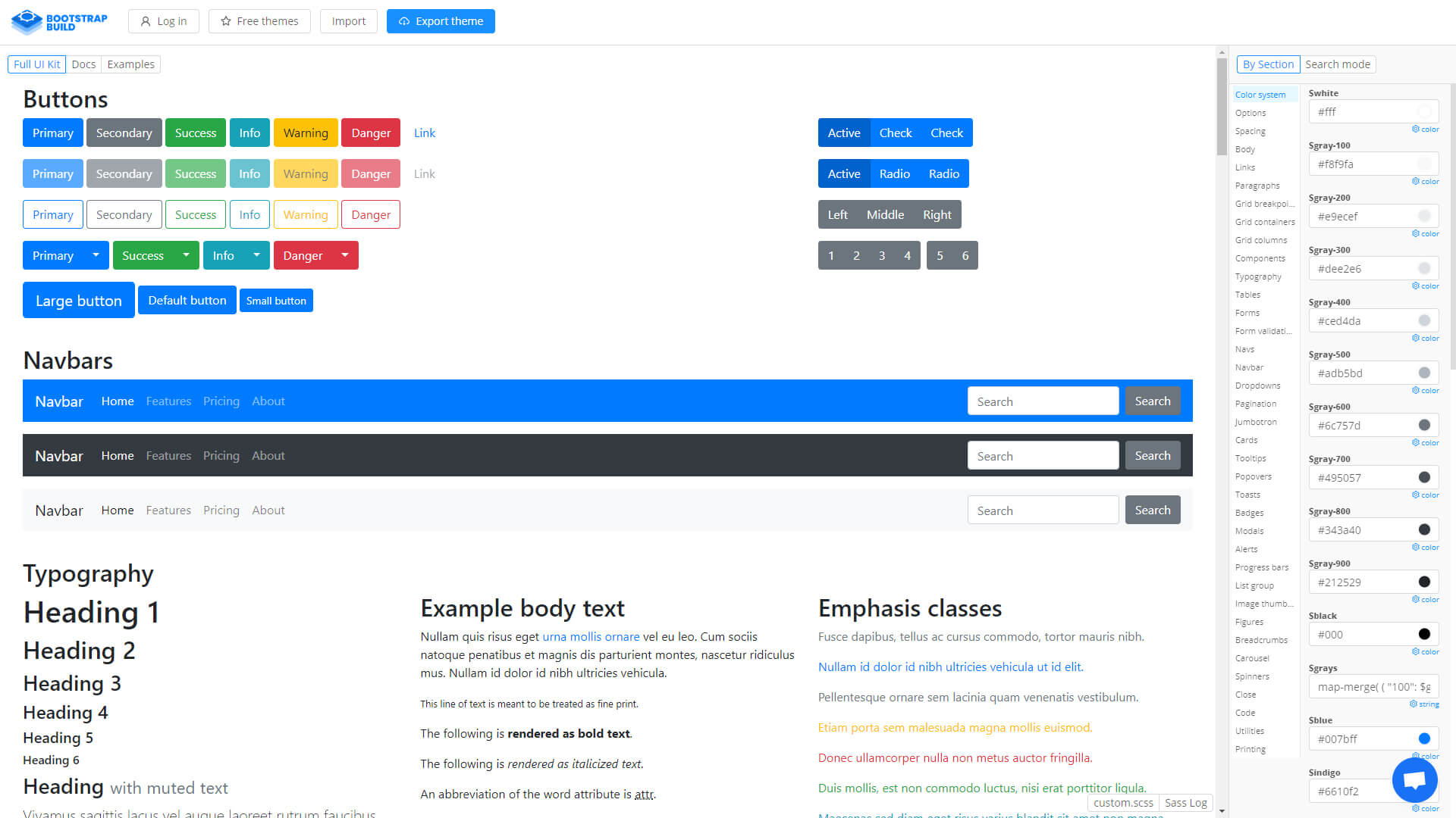
Note: This post is part 2 of 4 of our UI Themes post series, click here to see part 1. On part 1 of this series we’ve covered the basics of Theme editing and made a demonstration video showing how SCSS variable editing works. In this second post of the series we’re going a little deeper. One of the bigger challenges of editing a theme using Bootstrap 4 variables is actually finding out what variables are available, and exactly what do they control. Today we’re introducing a third-party website, Bootstrap Build, where you’ll be able to see every available Bootstrap variable and even live edit it to see what its supposed to control.
Bootstrap Bulld UI Kit Dashboard

At a glance this tool seems overwhelming, but it’s actually very simple to use. Let’s break down the basics of how to navigate within Bootstrap Build, so that we can find the variables we want to change:
– Full UI Kit: a list of every single Bootstrap 4 element available;
– Sidebar: with all available variables categorized by type of element (button, link, etc), a search function and live editing;
Theme Building - Part 2
If you remember our video from part one, you know that we edited only three variables in that example. However, because it was such as basic example, the theme is not yet finished.
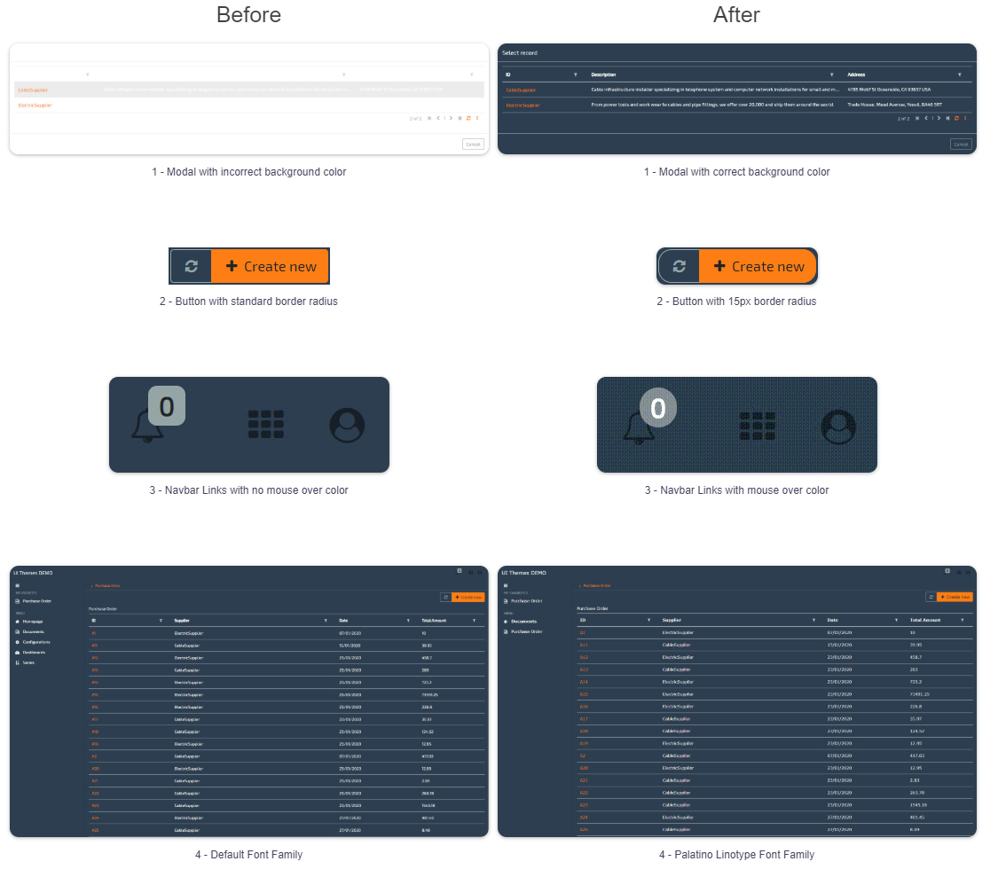
In today’s video we’re going to improve on that same theme and learn how to edit the following elements:

One of the challenges of building/editing a theme is knowing what variables we need to use. So, how do we know which variable we need to edit to obtain these results? Here’s our recommendation:
– Look through the entire UI Kit and try and visually try to find the type of element you want to edit (Button, Modal, Typography, etc);
– Look through the category list;
– Search using User Interface keywords (link, font, container, etc);
In order to change these elements as demonstrated above, these are the variables we need to edit:
- $modal-content-bg: from White (#FFFFFF) to a Dark Blue (#2C3E50);
- $border-radius: from .25rem to 15px;
- $navbar-light-hover-color: default to Orange (#fd7e14 – theme’s primary color)
- $font-family-base: default to Verdana.
Here’s the video of the entire process, so you’ll see how you can use Bootstrap Build to help you develop new and beatuful themes for your OMNIA applications:
Note: Parts 3 and 4 of this series will feature more complex scenarios. Part 1 was focused on the basics of theme editing.